Feeling Sick or Unlucky

Let’s play doctor.Image result for doctor holding stethoscope

Let’s say you have a patient who shows signs of a disease that’s tricky to diagnose.  In fact, of the people who show these symptoms, only 1 in 100 have the disease.  The test is only successful in detecting the disease 90% of the time.  The test can also fail by incorrectly indicating a “false positive” (i.e., test results show you have the disease when in fact, you do not) 9% of the time.

How do you feel about them odds?

Since this case study is appearing on this blog, you are correct in thinking there is a trick.  In the real world, physicians are confronted with these type of odds all the time.  To make matters worse, the percentages are even murkier, for example, with overlapping or contradicting studies.  The neuroscientist Daniel Levitin, in his book ‘A Field Guide to Lies’ cites a study the indicates that 90% of physicians make the error of conducting the test.
What’s the error?  The odds are that about 9 in 10 positive results are actual false positives.  If the test shows that your patient has the disease, you are nine times more wrong than you are right.  This test, is therefore, useless, or worse than useless.
One thing I have learned is that maintaining one or two numbers and the relationship between them is relatively easy.  When you have to deal with three numbers, even if the math is easy, things get hard really fast.  To do the above math in your head, you have to do a few things.
  1. Track the “patient does not have the disease” part of the equation.  Using numbers from above, 99 do not have the disease, 9% false positive is about 9 people.
  2. Compare that to the “correct positive” of the 1 person who has the disease and gets a positive result”.  Let’s round up and say it’s one person.

Nine false positives to one correct positive.  Feeling lucky?

Infographic on Commuter Volumes Across Different CIties

Screen Shot 2014-09-17 at 3.14.05 PMI saw this article on the Future of Daily Travel, part of the Good Cities Project.  The slightly-larger-than thumbnail sized infographic seemed intriguing.  So I bookmarked the page so I could come back to it later when I had the chance to really dig into it.

So many things going for it!  2.5D isometrics, used as graphic, colors, use of different types of transportation, use of XY space.  I couldn’t wait to get to it.

What a disappointment when I finally had a chance to look into it!

Any graphic has to be relatively easy to interpret.  The best allow you to “start easy” and get some initial “aha!”s, and then dig deeper, like some fine piece of art.  It’s OK to challenge and stretch your audience, but the payoff has to be there.  The opposite of this is to have the audience think, “is that it?”.  Or to make them feel dumb (I discuss this in a separate blog post).

It took me a while to realize that the icons (sprites for boats, cars, London double-decker buses, trains, etc.) had no meaning.  When you have something that take up that much room and color, it has to mean something.  It turns out that the LENGTH of the transportation does matter… BUT the location in XY space does not matter.  Or if it does, I can’t figure out the meaning.

Does the location of the person with the “Cost per Commuter” matter?  I dunno.  The # is nice, but there’s no way to compare it across the cities.  Maybe there is… I can’t tell.

Also, I got lost in the 2 colored lines per city.  Sure, most of the transport requires two line in the real world… is that what we’re trying to show?

There’s a lot of info here, and it still draws you in.  But I found it difficult to filter out what was informative and what was just cute.

What’s the “informative to cute” ratio in your graphics?

Guessing how many jelly beans in a jar

How many jelly beans in a jar?  Or candy pieces?  Or odd shaped Lego pieces of differing size?  What if the container is oddly-shaped?  Or we have multiple jars?

I always enjoy a good estimation challenge and find it difficult to pass up a chance to “make a guess and win it all!”.  So what are some good strategies?

You can always spend a lot of time and try to count as many as you can see, then apply some math.  This works well if you are dealing with a well defined shape, like jelly beans, and know something about the container (you can stuff about 900-950 “regular” sized jelly beans in a gallon jar).  What happens if you have oddly shaped containers, or you have some other objects mixed in?  What happens if you are dealing with an assortment of different candies and chocolates?  (Which, in my opinion, are better winnings.)

The following are some strategies for increasing your odds.  I believe there are some applications to business and management, as estimating is something we do more often than we think.

1.  Do NOT look at others’ guesses before making a guess.  Doing so may inadvertently set an “anchor” for your guess.  In any kind of estimation, you want to avoid “bad” anchors.  Chances are, you are not dealing with pros anyway.

2.  Plan on spending a little bit of time.  Not “take out a pencil and calculate the definite integral of 3D space” time, but more than 5 seconds.  Often times, we cheat ourselves of using our information and instinct (both important factors in estimating) and give up too fast.  What I have seen people do is this: they try some method, like counting the whole pieces they can see.  Then they realize that the method does NOT lead to a good estimate.  “If I can count ~50 whole pieces, and about ~40 half pieces, how am I going to use that info?”.  Then they give up.

An important lesson is this: sometimes we think we need very specific data (how many whole pieces can I count), but when you actually have that data, we don’t know how to use it or what it really means.  Data is always important, but don’t be fooled into thinking that data = answer.

3a.  Having said that, do some counting.  Cut up the jar into sections, like in halves or thirds.  Take special care if the jar is tapered.  Just get to some manageable subpart, then see what you can count.  Do a gut-feel estimate based on how you think things are arranged inside.  Pick up the jar, feel the weight.

3b.  Then start over.  This is the mistake that many people make in estimating: they only do it once, and only using one method.  We bias ourselves into thinking whatever method we first start with is the superior method.  This is what clouds our judgment for stuff like this.  So, take another “fresh” estimate, maybe working from counting what you can see from the bottom.  Maybe give yourself a break between the two estimates.  Whatever you do, you MUST not bias your second estimate with your first.  Do NOT look at others’ guesses while you come up with this second estimate.

4.  Then come up with something between these two numbers.  Remember that number.  Then walk away.  That’s right.  Unless the time is running out, just walk away.  Come back later.

5.  When it’s time for the guessing to be finished, come back and THEN take a look at the others’ guesses.  Here’s the trick: tweak your guess by using the others’ guesses to be near the midpoint between two adjacent guesses.  For example, if you are thinking 1200, and someone has 1150 and another person has 1210, change your guess to be closer to 1150, such as 1180.

6.  When they reveal the answer, make a note of whether you guessed too high or too low.  Then think about what influenced your bias.  Were you surprised at how heavy the jar was, and then guessed too high a number?  Did you actually think about how awful it would be to eat the whole jar, and then guessed too low a number?

7.  Look forward to the next guessing opportunity to get better at this.

It’s not a surprise to those who have read other posts on this site, but the two common themes are:
1. Try to unbias yourself as much as possible, or in reality, since you can’t completely unbias yourself, at least understand what biases are at play.
2. Refine, learn and get better.

Now I See It! (The link between visualization and creativity)

We are visual people.  We recall past events by the mental picture we see (or create).  Words are powerful and can be precise, of course, but visual images can often leave very strong and lasting impressions in our minds.
It’s even in the way we describe our understanding of things.  When we say, “I see it!” to describe an idea, this is more than just saying, “I understand what you are saying.”.  We may actually visualize some embodiment of the idea, like someone using the product, walking through a business process, or people faces lighting up as they get their problems resolved.

To be clear, I am not talking about using images or visuals in our presentations or descriptions.  I am quite familiar with business diagrams, process maps, various charts and graphs and other (good and useful) visual tools we have developed over the decades.  These can be helpful, sometimes very helpful (or sometimes not).  Instead, I am talking about the mental work of visualizing something.

So what is the link between visualization and creativity?  In a recent TechCrunch post from Mark Suster, he claims that “all business success relies on creativity”.  He then goes on to describe how he uses visualization to drive creativity.  It’s a long post with one small NSFW element.  It’s also very personal, from a “what has worked for me” approach from Suster.  Other than that, I think it’s a good article.

It’s good because we don’t think much about creativity.  We label something as “creative” and use that terminology post facto, or in preparation of something we do.  But “being creative in something we are doing now” is something that’s relatively difficult if you are out of practice.  So before you draw, write, sort data, open a powerpoint template, even start an outline, maybe we should take a moment and visualize.  Think of what you are asked to do: re-design a business process, look for trends in data, create the world’s most perfect powerpoint page, prepare a weekly report, snuff out competition.  See if visualizing (as described in the TechCrunch post) helps.  It’s free, and it doesn’t have to take a lot of time.  And it gets easier and more productive over time.

2010: Year in Review (by Search Terms)

Welcome to the Business Analytics for a Complex World!  Or in some cases, welcome back!  Many of you are here because you know me, or I have pointed you to a specific post.  Some are clicking through from LinkedIn, facebook, or other hard links.  But many of you are finding this blog through search engines.  Thanks to some nice tools provided by wordpress and statcounter, I know which terms were used to find this blog in 2010.

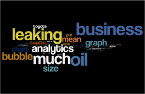
This is a word cloud of the most popular words used to find this blog.  This first picture is “mostly unfiltered”.  The size of each word reflects the frequency (the number of times) used in a search engine request that someone used to click through to this blog.  (The colors mean nothing in this graphic.)  The only words not included are common English words, like “a”, “the”, “is”, etc.

What stands out?  The word, “business” is quite popular — but that’s to be expected.  There are smatterings of other words that seem to show up: “bubble”, “analytics”, “chart”, etc.

I find such word clouds to be interesting; however, in most cases, it helps to show more than one word cloud, even if it’s based on the same content.  That’s because, I believe, it’s important to help your audience not feel like an idiot.  Let me explain.  Any new graphic, even if it’s “obvious” takes some time to get used to.  With one example, sometimes it’s hard to get used to the new graph.

So, I generated a second graphic:

The second picture is like the first, but I weighted the terms that were used multiple times.  For example, the exact search term “how much oil is leaking” was by far the most popular (several hundred!), so I increased the size of some of those terms.  This does several things to the picture: it starts to show that there are a few “tiers” or “levels” of popular terms.  This helps us to focus on the most popular terms, such as “leaking”, “bubble”, “analytics”, and so on.

Remember that your audience goes through a few phases when they see something like this.  At first, they have to figure out what it is.  Then they have to figure out what it might mean.  You may be very familiar with the underlying topic and “what the graph” means, but please be courteous to your audience… provide a simple guide or step-through.

You give complex diagrams… a bad name

Death by PowerPoint

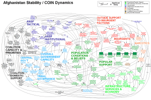
It’s not often that a Powerpoint page makes it to the front page of a national newspaper.  The story goes like this.  Leaders were discussing the complexity of American Military strategy in Afghanistan.  Someone prepared a PowerPoint slide after lots of work.  The slide was shown to Gen. Stanley A. McChrystal, who leads the US and NATO forces.  There was a awkward pause, broken by his observation that “when we understand that slide, we’ll have won the war.”  The audience lets out a roar of laughter.  The presenters and diagram-preparers are embarrassed.

Perhaps you’ve seen this page.  It’s become its own meme.  It was ridiculed by many, including Jon Stewart and probably many of your Facebook friends.  It confirms what many of us have seen with our own eyes: there’s a fine line between trying to communicate a memorable story and drop-off-the-cliff absurdity, especially when you are dealing with a complex story.

As a stand-alone, this is a horrible picture.  Many pictures that try to tell a complex story do not do well by sitting by themselves.  Your audience may be familiar with the topics and may even agree with what you are trying to communicate.  But in general, our audience needs a guided tour through something like this.

There’s a certain fluency required in understanding a complex causal loop diagram.  What makes it worse is that without a guided tour, your audience is misled into thinking that since they can read parts of the diagram, they can also read the “whole diagram”.  This is faulty logic.  You don’t want to make the audience seem dumb.  Your audience may be very smart, but when confronted with a diagram like this, they are likely to ask some practical questions.  Where do I start?  What does this mean?  If there are no grips or footings to stand on, your audience will fall, or at least feel like they are slipping.  So they ridicule the diagram, say nothing, or wait until someone says something funny.

So what do you do if you have a complex story to tell that’s best represented by a causal loop diagram?

You should first establish some “basic rules” of how something like this is read.  There are many ways to do this depending on what you are discussing, how many diagrams are in play, your relationship to your audience and a host of other factors.  Sometimes a one-page introduction with a description of what the following diagram shows, along with one loop or a few links does the trick.

You can show things in chunks.  Do you notice the colors?  There are subsections or subsystems.  You can start with an overall subsystem diagram that shows the stakeholders and links… maybe this has only 5-10 actors and only 10-15 links.  All we’re doing is establishing that there are many players and different relationships… not enough detail to be useful, but enough to engage and prepare the discussion.  Then build out details, chunks at a time.

Never forget to explain WHAT you are trying to do with the diagram.  Also notice that it’s “what YOU are trying to do”, and not “what the DIAGRAM is trying to do”.  The diagram does nothing.  Except confuse and amuse.  Human beings (like you or the audience) use, show, debate, decide, tell stories, and understand.

Ecologist Eric Berlow presents a good approach to stuff like this at a TED conference.  He starts with the whole, then gets rid of stuff.  The key is that he gets rid of stuff to fit a certain sub-story.  I call this “collapsing” the diagram… not a great use of the terminology, I admit, but useful in helping the audience feel a bit of relief from the task of dealing with everything.

Business Complexity and the Global Leader

Why do companies fail?  We have smart people, lots of data, lots of resources, and sometimes even a successful track record.  Can we learn something from how cities have grown, Rome prospered and fell, Sahara villages sustain (or decline), flocks of birds migrate?  Are there underlying similarities across customers who buy your stuff, people who elect leaders, fish that flee prey, termites that build mounds, and cells that build organs?

These were some of the questions discussed recently at the Business Complexity & the Global Leader Conference, hosted by The Institute for Executive Education, Sawyer Business School at Suffolk University, last week in Boston, MA.

If you are interested, you can download some of the presentations here.  Complexity is hard to describe, sometimes uncomfortable to discuss.  Sometimes, it’s frustrating if the conversation turn into nothing more than overlapping descriptions of how bad something is, or the descriptions (or solutions) seem too academic.  Somehow we managed to avoid those pitfalls during the 2.5 days of presentations, workshops and networking events.

Business is complex, and it will continue to get more so.  We have to have ways of discussing and managing this ever-growing complexity.  Are you ready?  Is your organization equipped?

Why Your Construction Project Estimates are Wrong

According to WSJ’s The Numbers Guy, most infrastructure projects end up with very large overruns.   Surprised?   Probably not.  This is one of those casual conversation topics where many of us can point to a project close to home that have “busted the budget”.   New Jersey’s rail tunnel to New York City, Boston’s Big Dig, Sydney Opera House, your local sports stadium, the highway project on the other side of town… what you have been suspecting (that these big projects become more expensive) is correct, at least according to people who study these things.

So why is this the case?   Like many complex situations, there are several elements at play.  Estimating is always a tricky task.  Even experts cannot estimate as well as they think they should.  In fact, having expertise often affects your estimates in two (bad) ways.  According to Professors Magne Jørgensen and Dale Griffin, there is a link between forward looking perspective and irrational optimism.  You are an expert, you are asked to provide an estimate, you feel optimistic about the future, and give a favorable estimate.  According to Nassim Nicholas Taleb, author of The Black Swan, expertise gives you an unwarranted sense of certainty in situations where such certainty cannot exist.

There are other factors at play.  For example, the larger the project, the more likely that there will be more stakeholders and more ideas.  The public may want better aesthetics.  Public projects expand as other smaller projects are folded into the original project.  Also, the longer the project, the larger the risk of labor and material cost increases.  Some projects also end up paying for “externalities cost” that may not have been originally planned.

If there are other bids involved, the winning project was more likely to be the most optimistic.  This is the so-called winner’s curse.  Yipee, we won the project… And we’ve also convinced the public, officials (and ourselves!) that our estimates are correct.

Finally, there could be misrepresentation and outright lying.  The articles acknowledge this, but does not go into research findings.  I suspect, as the article implies, that there is very little systemic large-scale lying in the industry.  It’s most likely the other factors described above.

Big estimates are big numbers, and we do not deal well with big numbers, experts included.  We remember numbers incorrectly.  For example, we may remember that a project was supposed to be $100MM, but forget that with the additional approved budget, the project eventually was set at $126MM.  It’s easier to remember something like “$100MM”.   Also, we don’t like to deal with ranges and uncertainty, and this is exacerbated with the large numbers we are dealing with.

So, is it wrong to be optimistic?   Are we just lying to ourselves?  Is it possible to have expertise and accuracy?

Bubble Charts — What does the size mean?

A few weeks back, there was a short article in the WSJ about 3M‘s recent acquisitions.  A very prominent bubble chart accompanied the article (in both print and on-line).

I generally like bubble charts,  It’s an easy way to show several dimensions.  Done well, it’s an efficient way to packing lots of useful info into a small space.  We tend to associate the size of the bubble with some magnitude.  In addition, you can use color and place the bubbles on a x-y graph.  With “size”, “x”, “y” and “color”, you get 4 dimensions on a chart.  Not bad… if you can keep it from getting out of hand.

For the article in question, using a bubble chart makes sense.  The punchline is something like, “wow, look at the size of the acquisitions!”  The tagline accompanying the graph is “Three Deals in Two Weeks.”

From Edward Tufte‘s class and personal experience, I have learned that a good graphic “tells a story” instead of only showing numbers.  Graphics should be constructed to make intuitive sense relatively quickly, and if possible, draw the audience in for more exploration.

Which is why I was disappointed in the three green bubbles for this article.  First, the only thing the graphic tells me is that there are three acquisitions that are being graphed.  Are there more acquisitions before this week or perhaps others that may be a candidate?  Also, it might be nice to have some sort of anchor.  For example, if we had a larger circle represent 3M’s annual revenue, or the value of all acquisitions in the five years prior to these three, a competitor… something to compare to.  If the punchline is indeed, “look at the size” or “look how many in such a short time”, maybe we could have placed them on some timeline.  Finally, a close look at the numbers are misleading.  If Arizant is a $810MM acquisition, why is the $943MM Cogent acquisition a smaller bubble?

Reading through the article (and a subsequent email exchange with WSJ) confirms that the Cogent bubble size is based on $430MM, the amount that represents the actual cost, taking into Cogent’s cash reserves.  I am told that the explanation was cut out in the graphic.  Maybe we could have had concentric or internal tangential circles, the larger one showing $810MM, and the smaller one showing $430MM.

Tainted Eggs and Sticky Accelerator Pedals

We’ve had hundreds of millions of eggs recalled in the last several weeks.  That’s more eggs than there are people in the United States.  According to CNN.com, there were 1,953 cases of Salmonella enteritidis reported in a 3-month period.  Salmonella hits you hard. It can leave you sick for a week with cramps, chills, headaches, vomiting, diarrhea.  And that’s if you are healthy.  The elderly, young or folks with weaker immunity can suffer much worse.

1,953 reported cases.  Even after the recall, there could be more cases since the symptoms can hit several days after consumption of tainted eggs.  That’s a lot of sick people.

Or is it?

Another recent recall involved Toyota vehicles and the problem of accelerator pedals.  Cars accelerated out of control.  People died.  There were multiple stories carried by the media in quick succession.  Police were interviewed.  Congressional hearings were held.  A company’s reputation was at stake.

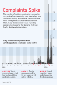
Take a look at the graph published by the Wall Street Journal that shows the “daily number of complaints about vehicle speed and accelerator pedal control” and the dates of some key events.  I am not sure what the “normal average daily complaint rate” should be, but before the warning from Toyota in late September 2009, it seem like there were fewer than 10 complaints per day.  There’s a small spike after the September warning.  The complaints seem to show a temporary peak about 6 weeks after this. In late November, Toyota announces a recall, accompanied by another spike in the days following.  Finally, in late Jan and early February 2010, there are calls to investigate the possibility of faulty electronics.  Around the time regulators officially expand the probe, the complaints spike, reaching a height of over 150 on a single day.

It’s difficult for Toyota to claim that either the drivers were becoming less careful or that the complaints were unjustified.  We have seen such PR blunders before from companies.  When a company makes such a mistake, no amount of science, facts, statistics or promises can fix the PR damage.

Back to the tainted eggs.  According the the CDC, from May to Jul, we would expect about 700 cases of Salmonella instead of 1,953.  Clearly, there is a spike associated with the eggs.  And it’s also likely that not all cases relating to the eggs have been reported.

What do you think?

Can recalls “cause” complaints?  Should companies (and organizations) revise the way recalls are done?  How should we use such statistics in setting the communications or policies regarding recalls?